Female Travel Safety App
Safety and Security App Design
Over View
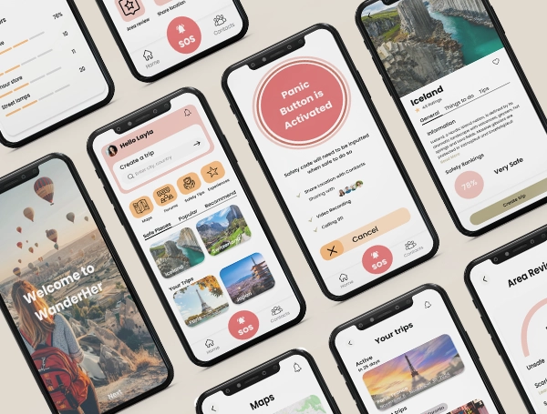
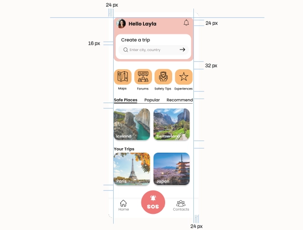
The Wanderher travel safety app was designed in Figma with the purpose of developing a simple and user-friendly interface that prioritizes safety. Wanderher is an innovative travel safety application specifically designed to empower and protect solo female travelers. The mission is to create a safe and more connected world for women exploring new destinations on their own. By providing comprehensive safety features, an intuitive itinerary management system, and a supportive community, Wanderher aims to enhance the solo travel experience for women around the globe.
Role
UX/UI Designer
Tools Used
Figma

Illustrator